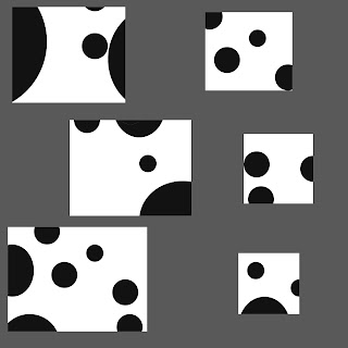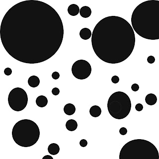

Here is the first segment from the discovered design assignment. I loved simplicity and this project was very enjoyable and relaxing for me. When I broke the larger image up into smaller pieces I found that I liked taking different sizes better than keeping the tiles the same size. To the left of the image is the cut outs and my arrangement. I am not so happy with the way it turned out so I am going to keep playing with it a little more. Any feedback would be greatly appreciated!
Good Start Jennifer.... If you hold down shift when you drag the eliptical marquee tool, you will get a perfect circle and not an elipse.
ReplyDeleteAlso, if you vary the size more and make them packed in colser, then you can choose perfect square selections... That combination will help tighten up the project!
closer, sorry
ReplyDeleteAlso, hold shift with the square marquee to make a perfect square...
We will use these in the next project, so it's important for it to be a square....
I like how your top image looks, it looks like a scatered work of art
ReplyDelete